Plotting Data
| Site: | Clare |
| Course: | Michigan Algebra I Sept. 2012 |
| Book: | Plotting Data |
| Printed by: | Guest user |
| Date: | Thursday, March 19, 2026, 5:35 PM |
Description
Plotting Data
Introduction
- How is the data dispersed?
- Are there outliers?
- What's the direction of the data?
- Is there a pattern? Linear or a curve?
- How strong is the relationship between the 2 variables, if any?
- In this section you will learn to make a scatter plot, distinguish key ideas and describe the data in scatter plots.
Graphing

As with any graph, there are some general rules to follow. Be sure to use a ruler, label the axes including appropriate scales and units, and title the graph. Now plot the data points. Each ordered pair is an (x , y) value. The independent variable (x) will be placed on the horizontal axis while the dependent variable (y) goes on the vertical axis. The dependent variable changes or "depends" on the value of the independent variable.
Example
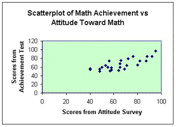
Each data point in this case represents an individual's score on an attitude toward mathematics survey and their score on a mathematics achievement test. For example, two students scored 46 on the attitude survey and their scores on the math test were 54 and 56. The student who scored 80 on the attitude survey had a 65 on the achievement test. Each point on the scatterplot represents a "pair" of scores.
Making a Scatterplot
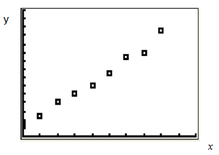
{(0, 3), (1, 5), (2, 8), (3, 10), (4, 12), (5, 15), (6, 19), (7,20), (8, 25)}
The result is the following graph:
Scatterplot
Using a TI Calculator
Graphing Calculators
Interactive Activity
Describing Distribution
The first has to do with the shape. Is the data symmetric (a mirror image)? Or is the data stretched to one end or the other? In a scatterplot, does the data appear to be linear or does the distribution look curved?
Some questions to consider when looking at a scatter plot include: are there any outliers or data that is removed from the rest of the data, what is the spread of the data, what are the smallest (minimum) and largest (maximum) data points, and finally what is the range of the data? To find the range, subtract the minimum from the maximum point.
Example
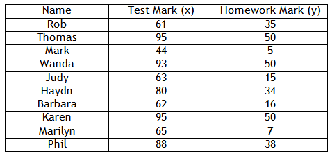
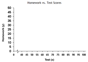
Step 1. Draw a set of axes and label them according to the table. Add an appropriate scale with equal increments.
Example Continued
The data is graphed below:
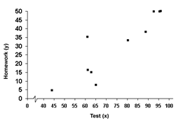
Step 3. Is there a relationship between the two variables?
The points are basically all doing the same thing, so there is a relationship.
Step 4. Is the graph linear or non-linear?
It is basically linear with a couple of points that do not follow the pattern.
Step 5. Is the relationship positive or negative? Is it strong or weak?
As the x-values increase, so do the y-values. Therefore, the graph is positive. Most of the points are in the same line, so it is relatively strong.
Guided Practice
To solidify your understanding of scatterplots, visit the following link to Holt, Rinehart and Winston Homework Help Online. It provides interactive practice with answers available.
For more practice, visit the PBS Teachers Mathline Temperature Activity. The solution for each problem can be found under the answers link at the top of the page
Guided Practice #2
Numb3rs Activity for Teachers
Numb3rs Activity
Online Practice
Practice
Answer Key
Correlation vs. Causation
Examples
Example 2 Correlation means that two things are related, but not necessarily cause-and-effect. In this case, there are two dependent variables. For instance, temperature vs. number of ice cream trucks on the street. These are a correlation because as temperature increases, so does the number of ice cream trucks. However, there is no causation - the increase in temperature does not cause the number of ice cream trucks to increase. This is because there are two dependent variables. If you said "increasing temperature causes an increase in ice cream trucks" it would also mean that "an increase in ice cream trucks causes an increase in temperature." This is clearly a false statement.
Lurking Variables
Sources
Answers.Yahoo.com, http://answers.yahoo.com/ question/index?qid=20090930154953AA7slTu (accessed 08/24/2010).
Central Virginia Governor's School, "Scatter Plot." http://www.cvgs.k12.va.us/DIGSTATS/Gmain.html (accessed 08/24/2010).
DavidMLane.com, "HyperStat Correlation." http://davidmlane.com/ hyperstat/A62692.html (accessed 08/24/2010).
Education.ti.com, "How Tall is the Criminal?" http://education.ti.com/ educationportal/activityexchange/Activity.do?cid=US&aId=5915 (accessed 09/03/2010).
Embracing Mathematics, Assessment & Technology in High Schools; A Michigan Mathematics & Science Partnership Grant Project
Holt, Rinehart, and Winston, Lesson 4 - 7 Scatterplots. http://go.hrw.com/activities/frameset.html?main=17384.html (accessed 09/03/2010).
MathBits, "Scatter Plots." http://mathbits.com/MathBits/ TISection/statistics1/scatterplot.htm (accessed 08/23/2010
PBS.org, "Weather: Rainfall." http://www.pbs.org/teachers/ mathline/concepts/weather/activity3.shtm (accessed 09/03/2010).
Psychwiki, "What is a Scatter Plot?." http://www.psychwiki.com/ wiki/What_is_a_scatterplot%3F (accessed 08/23/2010).
Shodor, "Scatter Plot." http://www.shodor.org/interactivate/ activities/ScatterPlot/ (accessed 08/23/2010).
TutorVista.com, "Example of Scatter Plots." http://www.tutorvista.com/ math/examples-of-scatterplots (accessed 08/24/2010).
Yale University, "Scatter Plot." http://www.stat.yale.edu/Courses/1997-98/101/scatter.htm (accessed 08/23/2010).